|
Importance of colorsColors, hue and shades in photography is one of the first impact, a viewer gets. It has its own way of communication. Some of them are shouting, others are calm. Some are natural and some are artificial. Each one has its own role in the content of a photograph, which initiate our emotions.
Radiation of electro-magnetic energy is in form of waves. These waves have certain wave length, which gives them certain properties to that particular wave length. Very long wave length of this radiation, which can be in meters are radio waves, which we cannot feel, but they are used in radio frequency. Shorter than radio waves are radar and infra-red, which are also not visible to our eyes. Only small range, which is from about 720 nm (nanometer) to 400 nm is visible to our eyes, and this is known as a visible spectrum. Shorter wave lengths, which are less that 380 nm are ultra-violet, x-rays and gamma rays, which are more energetic and gamma rays can even penetrate in metals. Each individual human analyzes this visible spectrum, in a slightly different way. So one shade of green, which is processed by one individual to perceive as some signal, may defer from other. That is how we like some colors, which other person may not like. This difference is perfectly acceptable for an average good human eye, but if this disorder is beyond the limitation, then the person can be color blind.
There are millions of shades, produced in this visible spectrum, but when we photograph, these shades are compressed into RGB format - that is red, green and blue. Combination and mixture of this three shades in various proportion and strength creates a convincing illusion to almost replicate the original subject, but there are some shades, which cannot be produced in a photograph. Some shades of orange, green and blue are very difficult to produce without some shift. As human eye is not very sensitive towards yellow, yellow safely escapes from this limitation.

Photograph by: Brian Fernandes There are some rules, which have to be followed when we play with hue. As each of them has its own language and personality, it also has limitations for application. Hue convey mood and atmosphere of the image and when we have to achieve a success, we have to select the right one.
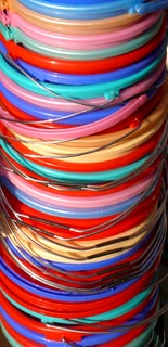
Shades in combination of three, needs a careful composition. It works well provided the proportion of third shade is very less in terms of area but purity is at highest level. Example is green field and blue sky having some red flowers here and there. Use of more than three is very risky. It may create "riot of colors" Each hue is influenced by purity and brightness, which is termed as saturation and lightness. Each of them can be contaminated with some other hue, and the impact can be different. They can be contaminated with part of black, which is grey and loose their character. There are rules to work with them but rules can be broken to experiment with creativity.
Yellow
|
 Photograph by: Brian Fernandes