Dark colors - Visual Impact of Heaviness
Dark colors of any color shade makes the object look heavy. When percentage of black is added to any color, it becomes dark and murky. The shade is shifted from the virginity of the actual color and shows its own importance and attitude.
Moderate darker shade of any color, especially red, green and blue are associated with royalty and kingdom. Purity of the particular shade is lost and they need careful consideration in placement, as they are bound to make that area of a photograph imbalanced.
This shade has its own personality in different genre of photography. It could be main subject like any product and will stand out in front of lighter shade of same hue. Example can be a dark brown leather bag against light brown background, dark blue dress against light blue backgrounds and so on. However, we have to be careful when it comes for red color. Dark red in front of light red, which is rendered as pink, looks surprisingly unnatural as we are not familiar with pink as a natural background color. Secondly, in printing, pink is produced by percentage of magenta ink, which is not very pleasant and pure as compared to actual pink color. (If we need to have pink as a background color, then additional color is printed as special pink, and cost of printing production is increased.)
In nature and landscape, dark shades can be a subject (a stem of a tree or a rock) or they can be result of shadow area. In both the case, they will add dimension to the photograph.
These colors are first choice when we are approaching a low key photography, where the subject as well as the background is dark or black. They are manly colors mostly used in men's formal dresses. However, it also works in fashion photography for their natural contrast against the skin tone.
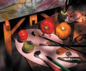
In food photography, darker colors need careful placement in composition, though many prepared food items are dark in color. Apart from dark blue, dark indigo and dark violet, all colors will work, when they are balanced with other colors, but we can break this rule.
When used in proper proportion, dark color really convert a snapshot into photograph with pictorial appeal.
On CMYK color mode, black plays important role with substantial percentage, though in some shades, it may be absent.
Read more about how other colors work in a photograph:
Black color
Blue color
Brown color
Complementary colors
Cool colors
Dull colors
Green color
Grey color
Impressive colors
Light colors
Purple color
Red color
Tranquil colors
Vivid colors
Warm colors
White color
Yellow color
Return back to Colors from Dark colors
Return back to Home Page
Enjoy this page? Please pay it forward. Here's how...
Would you prefer to share this page with others by linking to it?
- Click on the HTML link code below.
- Copy and paste it, adding a note of your own, into your blog, a Web page, forums, a blog comment,
your Facebook account, or anywhere that someone would find this page valuable.