|
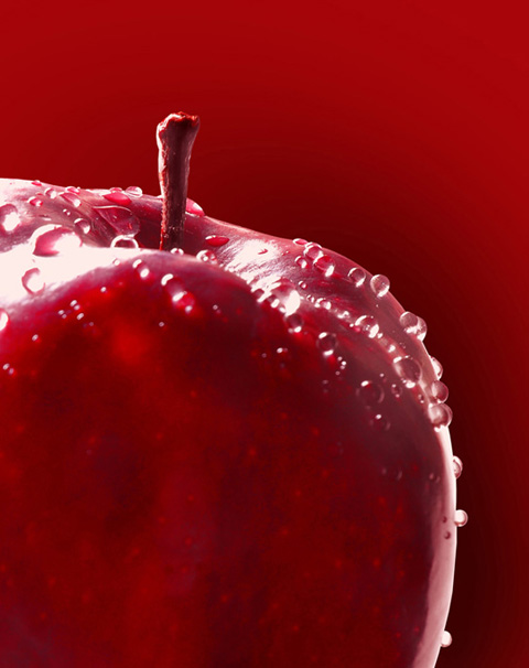
Colour HarmonyBeauty of Colour Harmony Harmony in colors of the subject and the background has a dramatic effect. It could be red on red, blue on blue and so on. All colors can work extremely well. This approach needs careful planning as color contrast is not playing any role in the image. Contrast in the photograph is created by tone, texture and depth of field.
This can be achieved with a strong side light or a back light. A spectacular high light created by angular light will separate out the subject from the back ground. Shadow on the other side can be control with a reflector. Size of the light source will depend on the nature of the surface of the subject. If surface of the subject is shiny, use large source of light and if it is matt, use medium or spot source of light. Keep back ground as simple as possible. Lighting on the back ground should be flat, so that no unwanted texture is recorded. 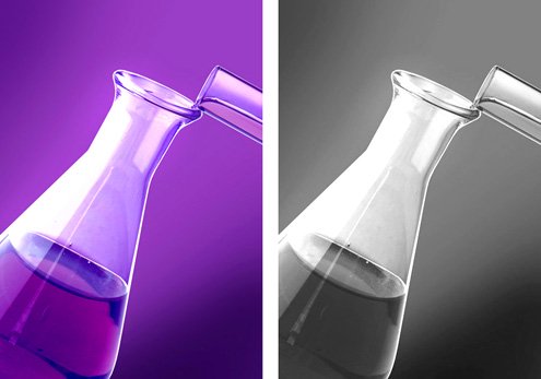
If this type of image is converted into black and white, it will still work as the tonal contrast in the image is strong and powerful. There is a spectacular high light and dense shadow area, which shows entire range of tonal value. Application of harmony in color works well in most of cases. This harmony must be used, especially when we are shooting a product for advertising use. In advertising use, the photograph may be converted in black and white, for printing in a news paper or a magazine, and in such case, because of enough tonal contrast, the photograph will still show pictorial appeal, which will work. When we use colors, placed next to each other on the color wheel, then also colour harmony is maintained, as those colors fall almost in similar hue. There is no boundary as such and slight territorial intrusive activity is acceptable. This is how, nature and landscape photography in green land and blue sky, gives tranquil and serene feel as there is no conflict in composition by colors.
|